DIY Wall Treatments & Accent Walls

Wall treatments have been around for centuries but have majorly regained their popularity in recent years. There are so many different types of wall treatments, from wallpaper to wainscoting, that one of them is almost guaranteed to catch your eye and fit in with your style. They are such a simple addition but can make a big statement in any home. The best part? You don’t have to hire an expensive woodworker or contractor to install them - many of them are extremely cost effective and easy enough to do yourself! And you know I’m a sucker for a good DIY…

There’s many more wall treatments and accent wall ideas than you’ll see here (wallpaper, tile, plaster, etc.,) but these are a few of the popular ones I get questions about in my home. And keep in mind these were all done by myself, Curtis, or with a little family help!


Beadboard

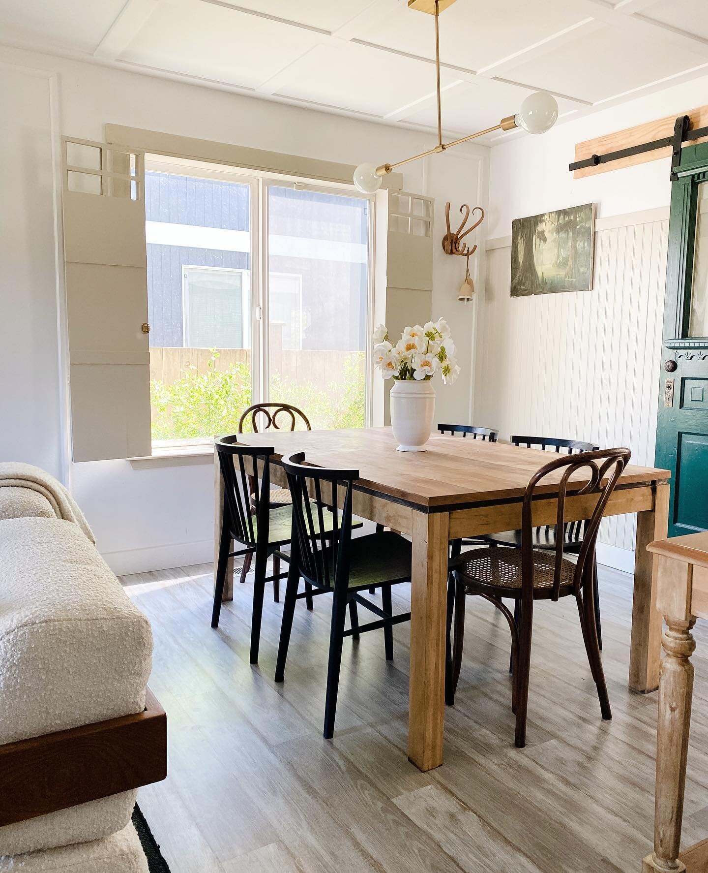
Beadboard consists of narrow wood planks stacked vertically that have a ridge or “bead” in between. Sometimes it’s used as wainscoting (any wall treatment covering the bottom third of the wall) or even as a ceiling accent. These days beadboard comes in long sheets that mimic the board-by-board look making it SO easy to install.

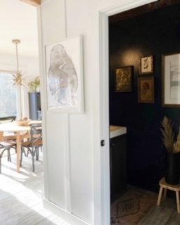
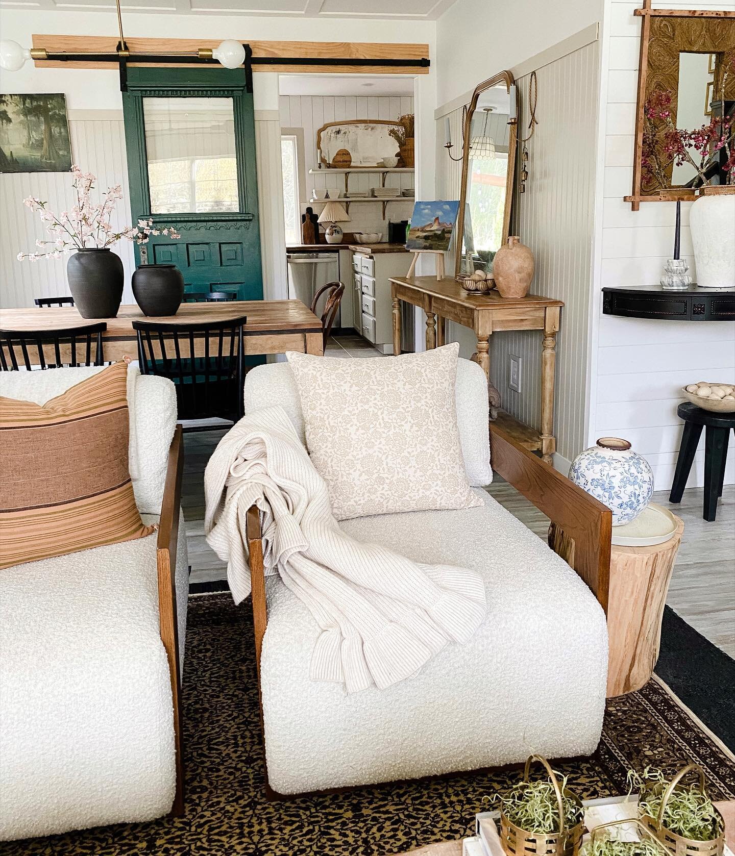
I ran my beadboard in the dining room about 2/3 up the wall and capped it with a finishing piece. Paint it the same color as the rest of the wall or room, or give it a complementary color that can add some depth and dimension to the room. Try it in a bathroom, bedroom, or even a ceiling. The possibilities are endless!

Shiplap

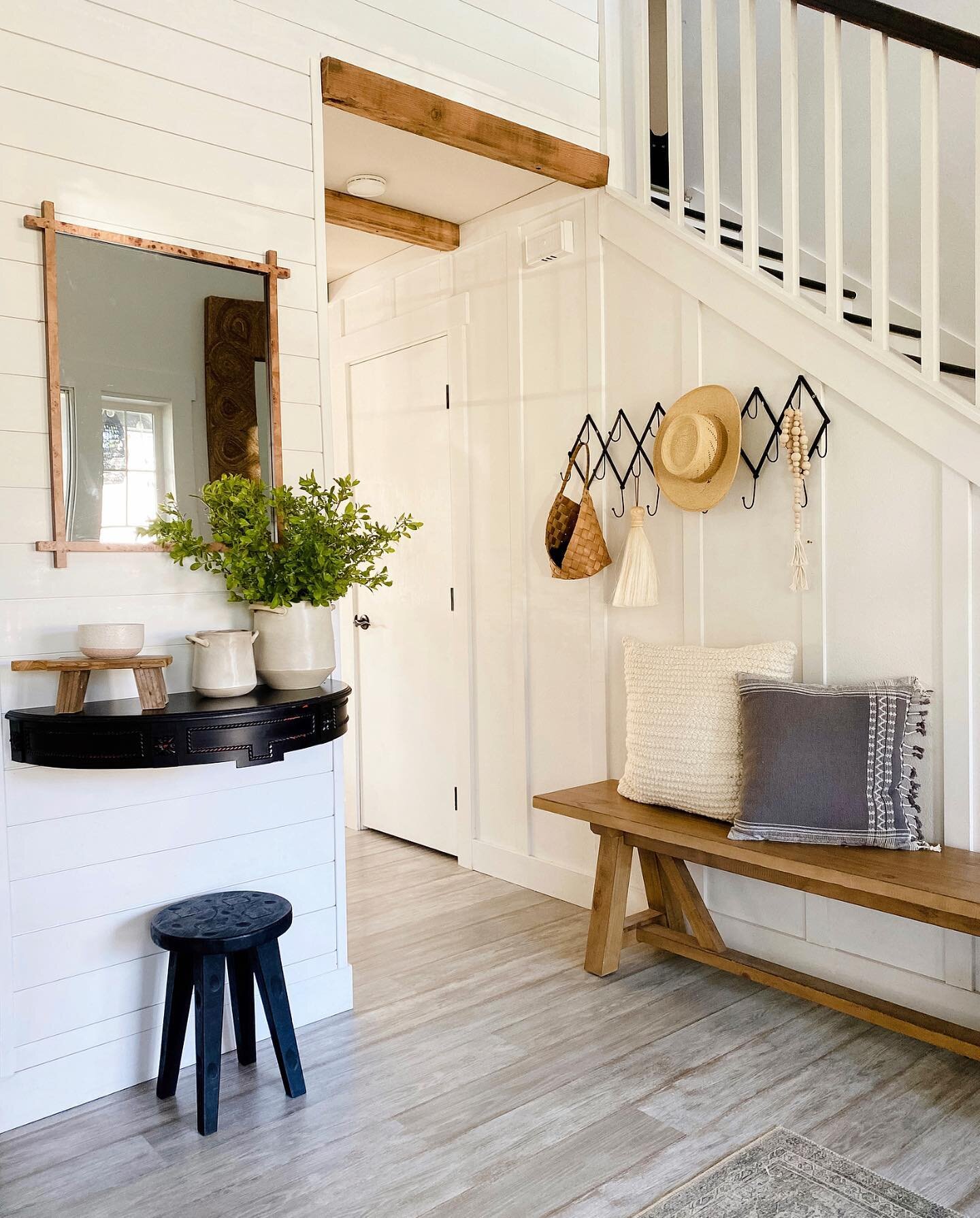
If you’ve watched HGTV at any point in the last ten years, there’s a good chance you already know what shiplap is. Some old homes have it conveniently hidden beneath drywall just waiting to be uncovered, but it is a trend that can easily be replicated with some simple planks of wood. The rustic charm and texture can make a space dramatically cozier and add a beautiful, simple backdrop for artwork and furnishings.

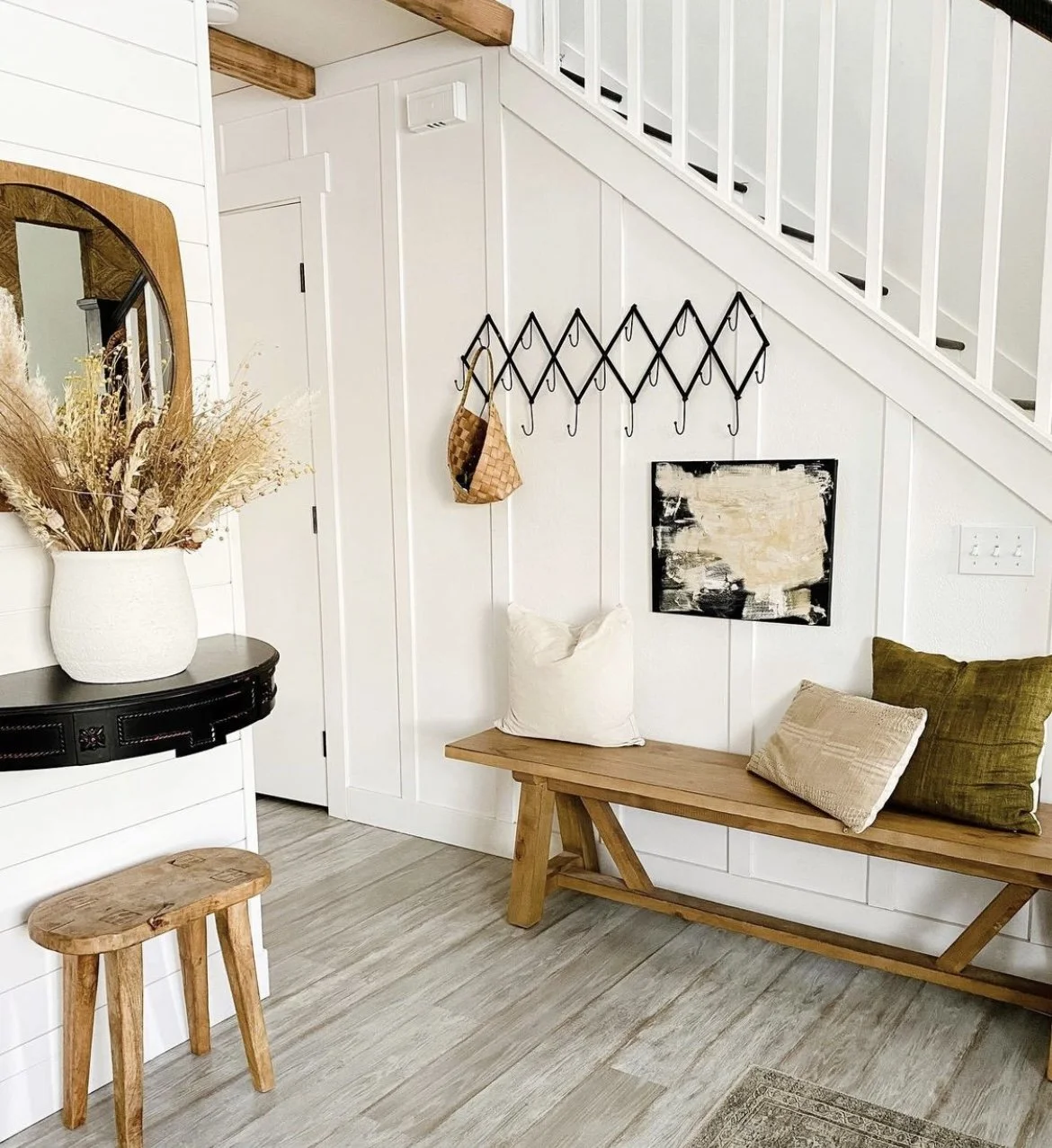
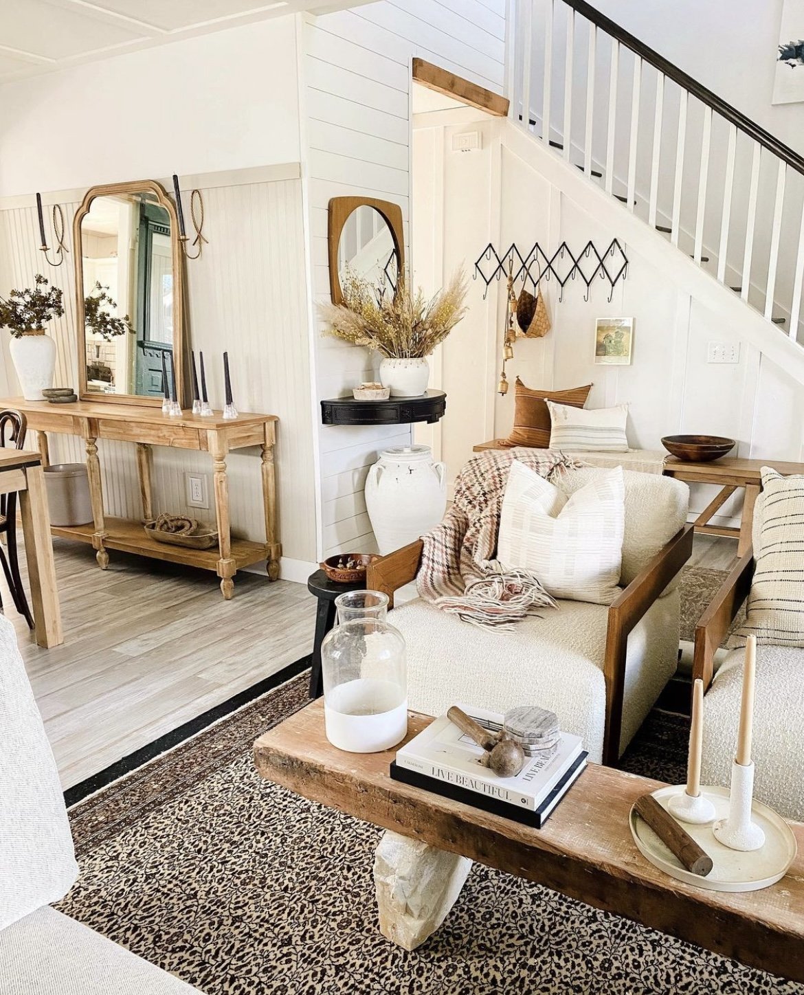
I have pockets of shiplap all over my home, some in the entryway, some in the living room, and some in our bedroom. To me it adds so much charm and a warm, cozy feel that is especially nice as an accent behind a bed frame or in a gathering space. You do have to nail it plank by plank so it takes a little patience but is a pretty easy weekend project and can be done with 1/4'“ plywood.

Slat Wall

Wood slat walls are a more recent design trend that really add a layer of depth and visual interest. They serve as great backgrounds for bedrooms and the walls underneath can be painted deep colors for added dimension. This slat wall we did in Jack’s room was a fun modern touch that added a ton of personality. What otherwise would have been a simple desk nook feels like a sleek, unique space you might actually want to do your homework in. The process is time consuming but still doable and uncomplicated. Opt for a sheet of plywood that you can cut into 1/2 to 2 inch strips yourself to save big on money, or use pre-cut 1x2 boards to save big on time. Pick your poison. Being the DIY queen I am I opted for the first option and while it was a pain in my butt it was well worth it in the end!

Board & Batten

Board and batten is a classic wall treatment that has been around for ages and is known as more of a traditional look (it was cheap and easy to use on sheds and barns back in the day). But nowadays it is popular in all styles of homes! Board and batten is made up of narrow planks (boards) with wider planks (battens) covering the seams. It can be in vertical stacks like in my entry or in a rectangular pattern like my living room ceiling. To save a little moolah you can also attach the battens directly to the drywall to simulate the look. Board and batten is great as wainscoting in a bathroom or dining room as well!

Box Trim

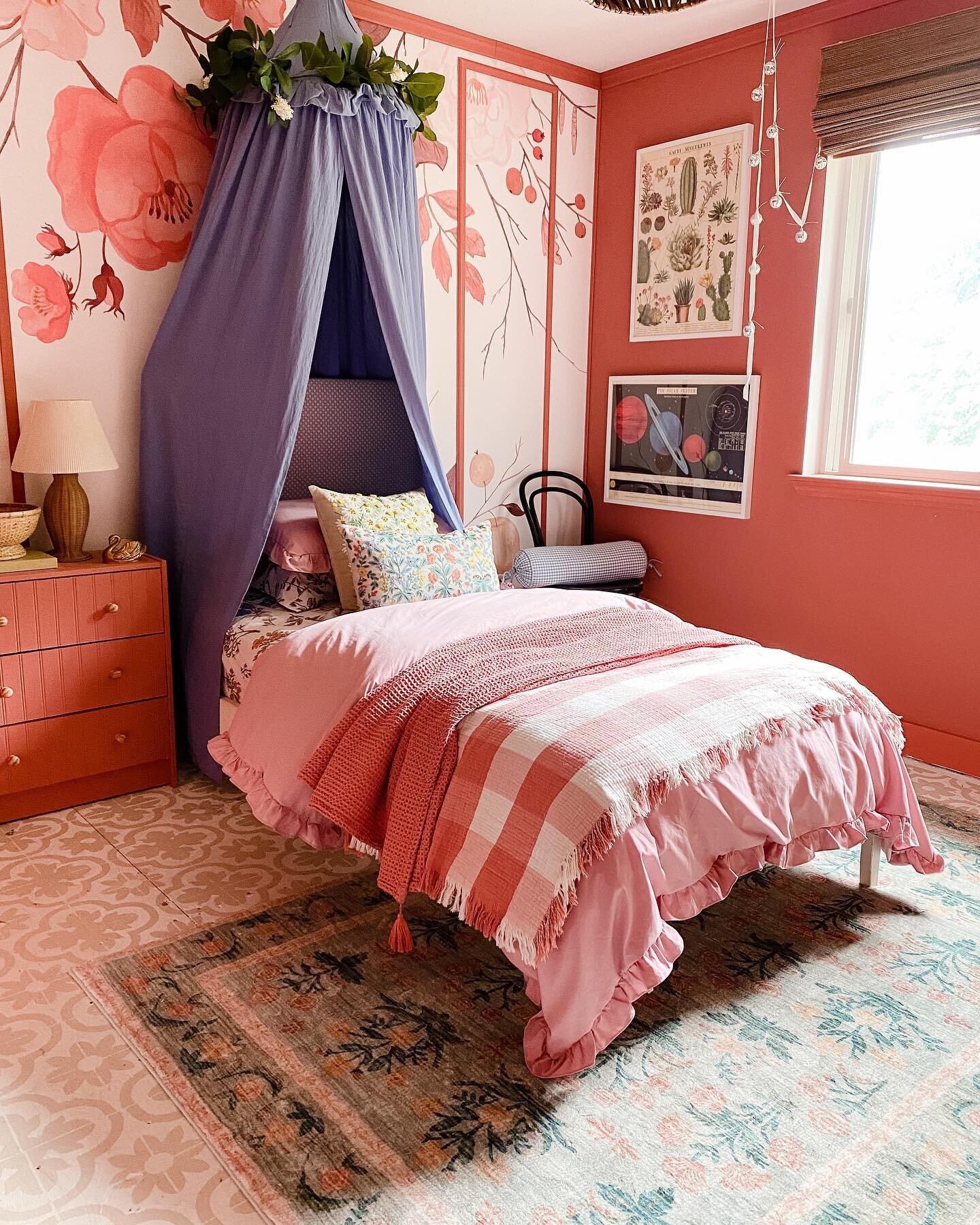
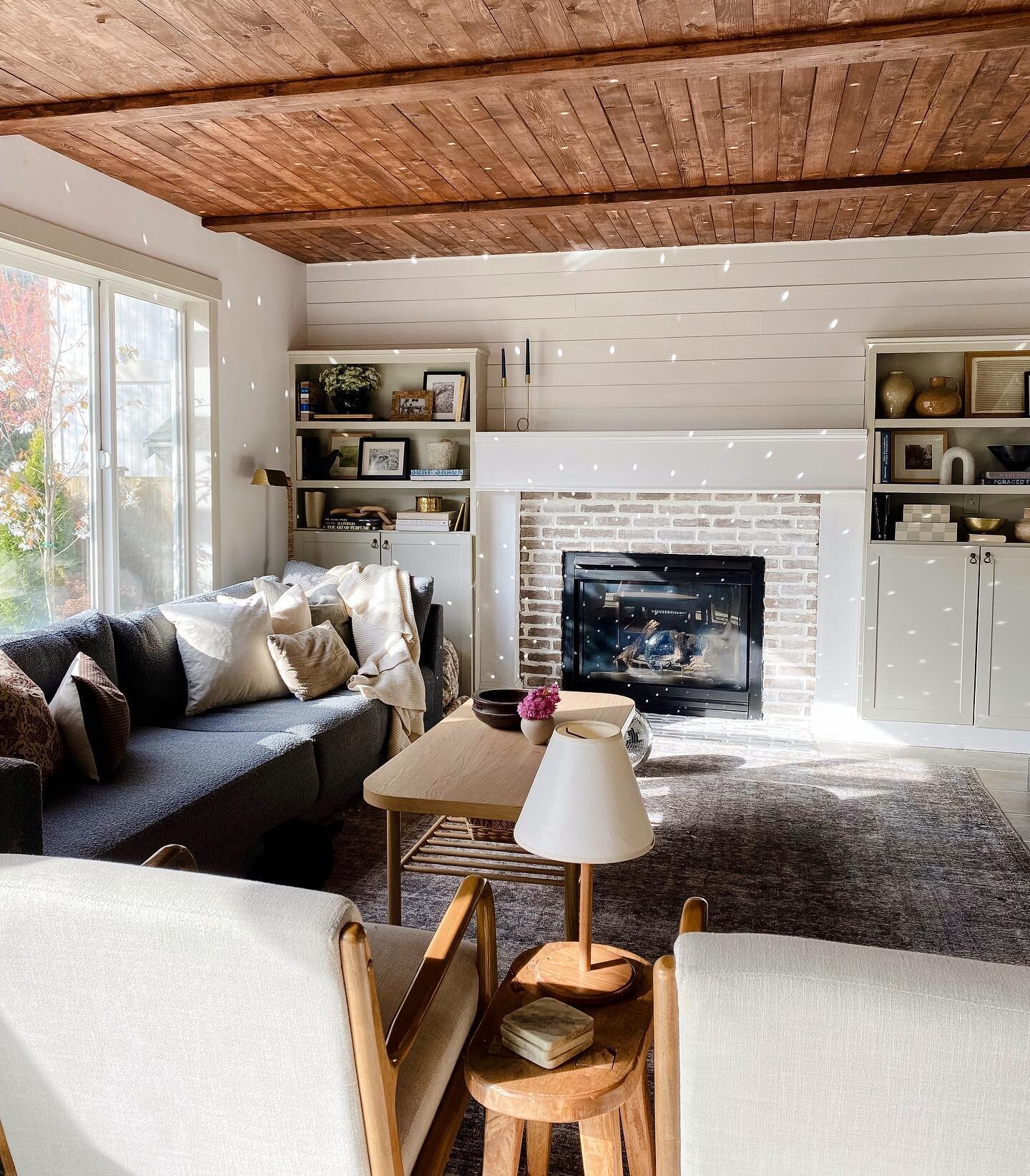
This wall treatment may also be known as shadow box trim or a few other names, but essentially it refers to frame-shaped trim installed on walls or layered on top of other moldings. It’s elegant and charming yet simple, and can be dressed up or down just like your favorite LBD.

Use any trim you like (base cap is a good choice for extra dimension) and adhere to the wall with liquid nails followed by brad nails. The key here is to measure twice, cut once and make sure you plan out your spacing ahead of time! Once installed, paint the entire wall whatever color your heart desires and you’ll have a gorgeous accent wall that serves as a statement but also isn’t overwhelming. I love that it almost acts like its own wall art with the framing effect too, you can find it in my living room!

How To Mix Wood Tones In Your Home

If you’ve seen my home before, you already know I love the warmth and earthiness that wood furniture and decor add to a room. It’s the perfect grounding balance to my favorite black and white combo, but it also complements playful colors just as well. I can’t imagine a space without some form of wood whether it be the floors, wood paneled walls, a rustic wooden door, or some weathered wood accents. It’s just simply one of the best and most versatile materials. However, I notice a lot of people start to panic when it comes to mixing wood tones in a home. Either they’re afraid to step outside the box and only use one single specific wood tone throughout their home, which can often look flat and one-dimensional. OR they use any and every wood piece they find in one space which can easily overpower a room. I think the key here is to find the perfect balance of wood tones that both complement and contrast. Here are a few tips for achieving that layered, lived-in look that designers strive for.

The first step to achieving this balance is to figure out (or create) your dominant wood tone. If you’re looking at a space from afar this would be the largest wood component that immediately stands out to you. Maybe it’s hardwood floors, a large wooden dining table, or a wood paneled ceiling like mine! Then ask yourself - is the tone light, medium or dark? Once you’ve got that established, you’ll want to draw in some contrasting tones next. For example, if you have dominant light maple floors you can bring in some dark walnut wood in a coffee table or console. Or if you have a large grey toned built-in that is the main focus, try bringing in some different cool wood tones such as a light pine or ashy colored wood.

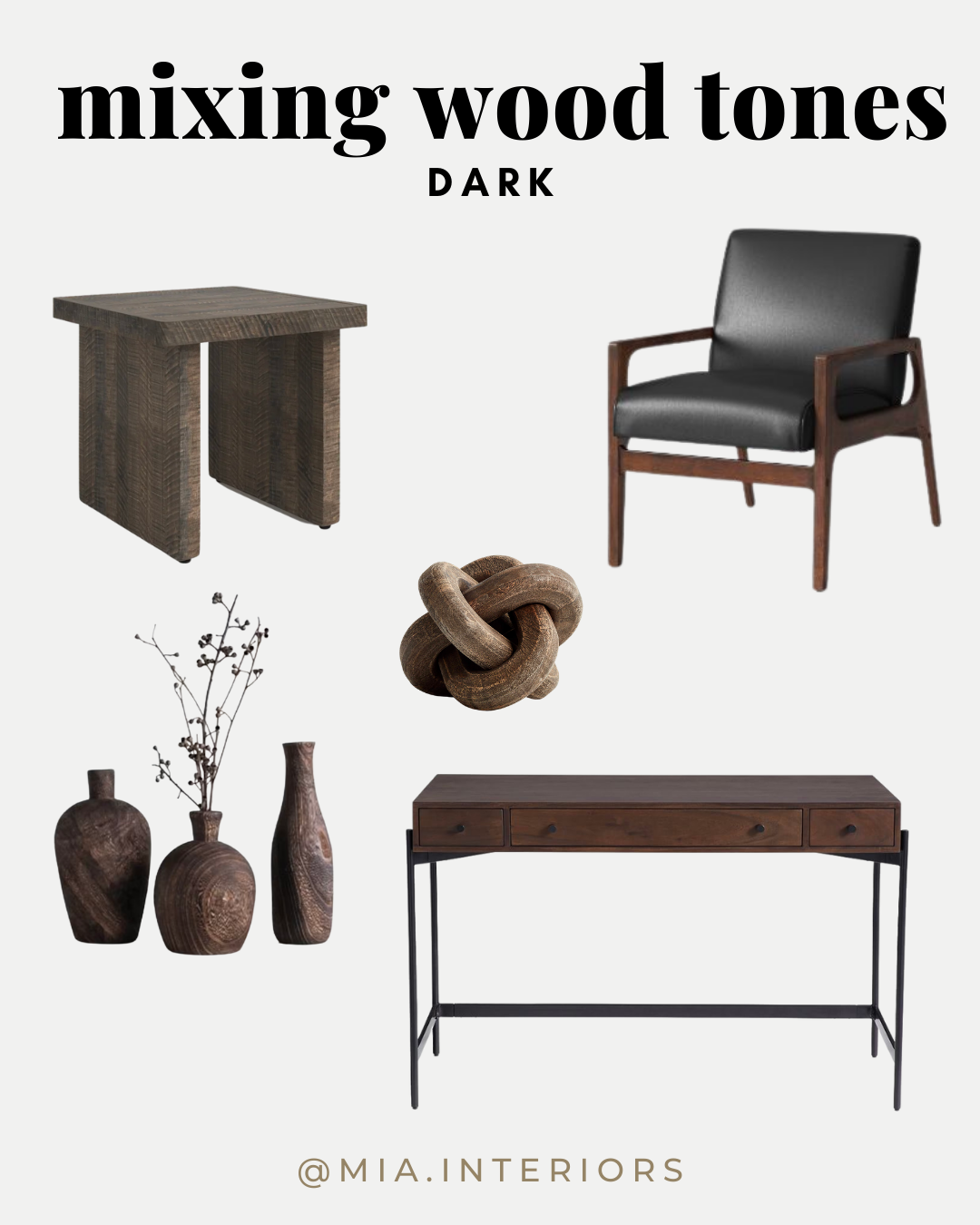
Slowly add in more contrasting tones until you have at least one variation of a light, medium, and dark wood. The key here is to make sure that each tone is repeated at least 2-3 times to give it a cohesive, curated look. It helps to vary the sizes too so maybe try a mix of furniture pieces, flooring/wall treatments, and then smaller accents. Wooden chain links, vases, bowls, decorative beads are all great small accent pieces to easily repeat a certain wood tone. Warm Toast Designs has some great affordable wooden decor including this wooden chain link that I have!

Try and stick to a palette of either warm or cool tones. Walnut, cherry and hickory tend to lean warm with orange, yellow, and red undertones. Whereas maple, poplar, ash, and pine are typically considered cooler tones that read more blue, green, black or gray. Walnut is a great go-to because it is so neutral and can easily read either way depending on the woods you mix it with!

Spread out the wood pieces throughout the space so they’re not clustered to one area. Layer in a patterned rug that breaks up your hardwood floors from your reclaimed wood coffee table or lounge chairs. Add in your other complementary materials like natural textiles, painted woods, ceramics, and metal finishes. These will add to the effortless “layered” look that we’re going for.

Before you know it you’ll have a balanced, cozy space that is accented by woods of all different shades! By following these easy tips, you should be able to let your dark woods and light woods happily intermingle without competing or overwhelming the room. If you’re still wanting a little more guidance or inspiration, here are some roundups of light, medium, and dark decor!

The Great Tile -Wave of 2021

The Great Tile-Wave of 2021

It all started like a tidal wave. Ok, actually a lot less water than that. More like a droplet. We had been ignoring a leak in our ceiling for more months than Curtis would like to admit because we didn’t want to fork out the extra cash when we thought it was something that we could fix on our own. Turns out, it wasn’t. When we finally swallowed our pride (and our budget) and hired out – we did not expect what would come next. We live in an early 2000’s build that is full of copper piping. These pipes have caused a few instances of grief, but none like “The Great Tile-Wave of 2021.”

When the plumber was here turning on and off the water repeatedly, he struck a cord, or more so a pin hole, with our pipes. This time it was in the kitchen.  The day after Thanksgiving Curtis and I were putting the house to bed when we heard an animal sound coming from inside the walls of the kitchen. Because it was an exterior wall he assumed that it may be wasps or bees because we have seen their nests on our house’s siding every summer. It didn’t seem like the appropriate time of year for insects, but 2020 pulled the rug out from everyone’s feet and maybe that applied to bugs too?

The next day Curtis was messing around in the kitchen when he called out my name and it was the kind of voice that I knew there was something that I didn’t want to see. Like a broken vintage, Christmas glass or smeared remnants of an omg-who-knows-what-that-is substance. What he was referring to, was the lifted flooring surrounding the dishwasher. After pulling out the dishwasher, running it and then running it again, Curtis climbing and knocking around underneath the house 3x, we determined it was coming from inside the wall. You could see water piling out of the hole that the electricity was running from. While the kids were in bed we knocked a giant hole in the wall that led us to find rising water levels inside the vapor barrier behind our drywall. And we could tell the leak was further up. Like, behind the shiplap, that was covered by shelving and all our dishes. As quickly as we could, we took down all our dishware and shelving, took off the shiplap, and with a ‘here goes nothing, cross your fingers it’s not behind the subway tile’, we took into the wall. We found it right away with the first hole that we made. Or I guess that was the second hole, first being behind the dishwasher. Luckily this was an easy fix and anyone that knows anything about plumbing would know what I mean when I said Curtis was easily able to shark bite it. THANK GOODNESS. But now we had a disaster. The floors were destroyed, our kitchen was torn apart, and all before Christmas. We were able to patch the walls and put them back together quite easily. The floors were another story. Because they had water sitting under them, mold had instantly begun to grow. Thankfully we discovered the mold on a night that the kids were sleeping at granny’s, and we were able to wash and dry the mold safely and quickly.

It took me what felt like ages to pick out new flooring. Realistically it was over a few days, but I have no chill and I like to make things happen instantaneously. When we discovered that the flooring we installed in the rest of our house was discontinued, we knew that we needed to install something completely different to look purposeful. We felt that the only remaining option (that was also within our budget) was tile. I wanted an organic look with hues that pulled from the flooring it’d butt up against and the rest of the rooms. The only flooring that I could find was an online only option and I was not able to view in person prior to purchasing. Again we pulled a ‘here goes nothing’ and bought enough tile to cover the kitchen, kitchen table and family room. And then we waited.

And waited. And waited and waited some more. Until two months passed, and our order was finally in at Home Depot. You’d be proud of me. This was the same day that Curtis’ weekend was beginning and if I’ve learned anything after being married to this man for nearly ten years, it’s that you can’t rush him. If ya want something done and you want it done with at least a half smile, ya gotta let him decide he wants to do it. I gave him a day. We picked up our order and I was able to see the tile in person for the first time. Cue angels singing. It was perfection! We took it home and got to “work, work, work, work, work.” (Thank you Rhianna.)

I had spontaneously booked family photos for the weekend coming and we had one week from start to finish to get these babies in place. If you’d like to see any tutorials about the actual tile install you can view them on my Instagram. I have saved the entire process in my highlights to a category entitled ‘Tile.’


Cost Breakdown:

Tile:$936.00

Cement Board:$464.10

Mortar:$50.94

Grout:$26.74

Screws:$19.00

Tape:$15.96

Wet/Tile Saw:$154.00

Total:$1666.74

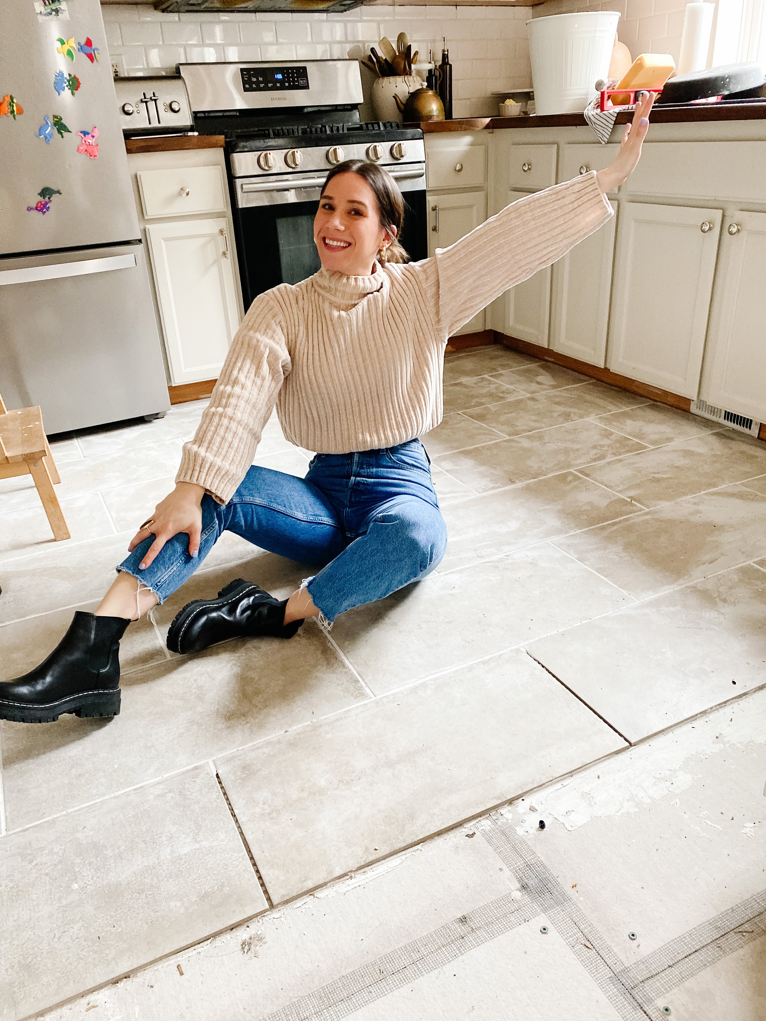
We made it in time for family photos!

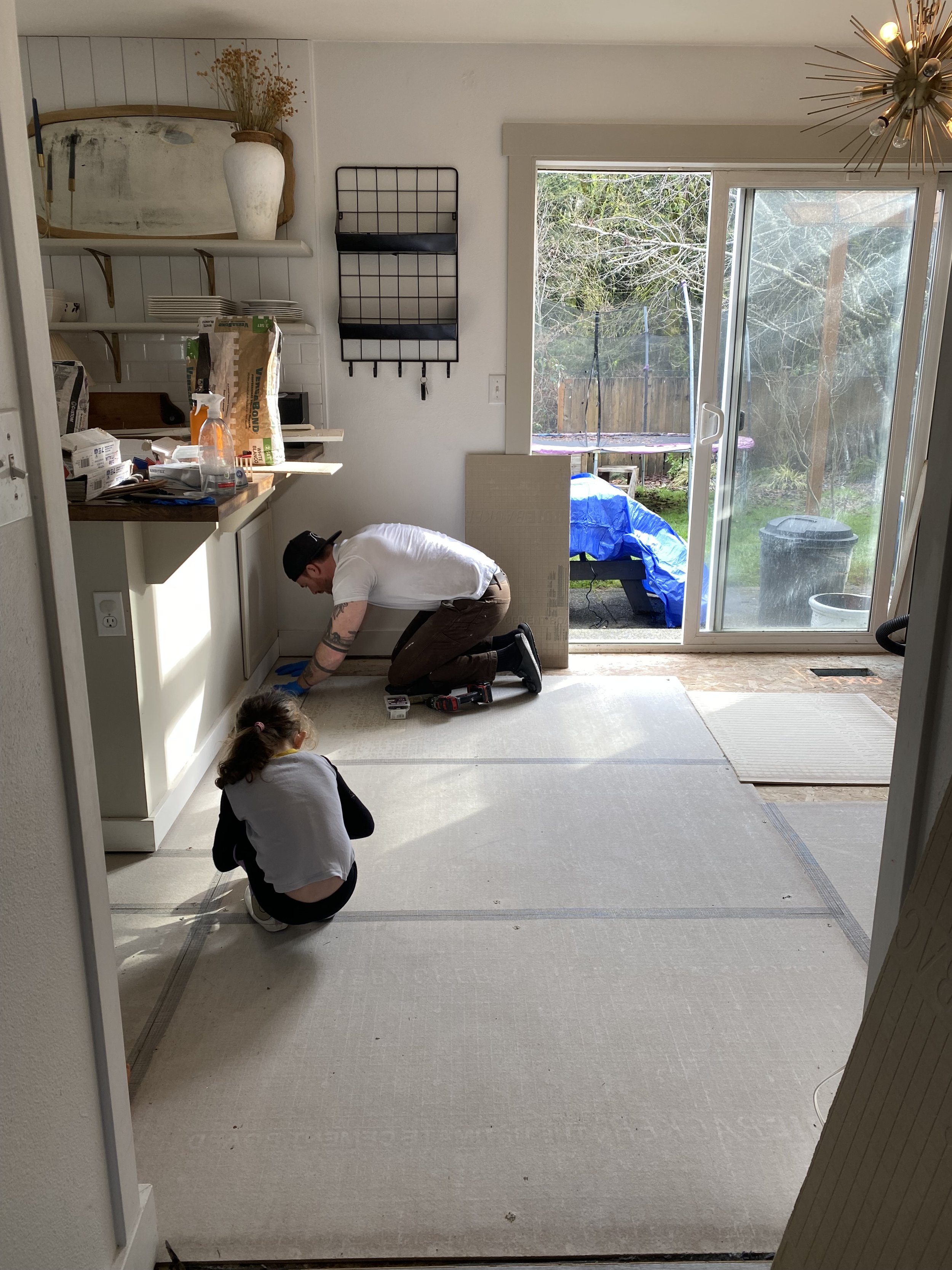
This is the after photo of ripping out the floors. Also my top viewed IG story in months. Misery loves company!

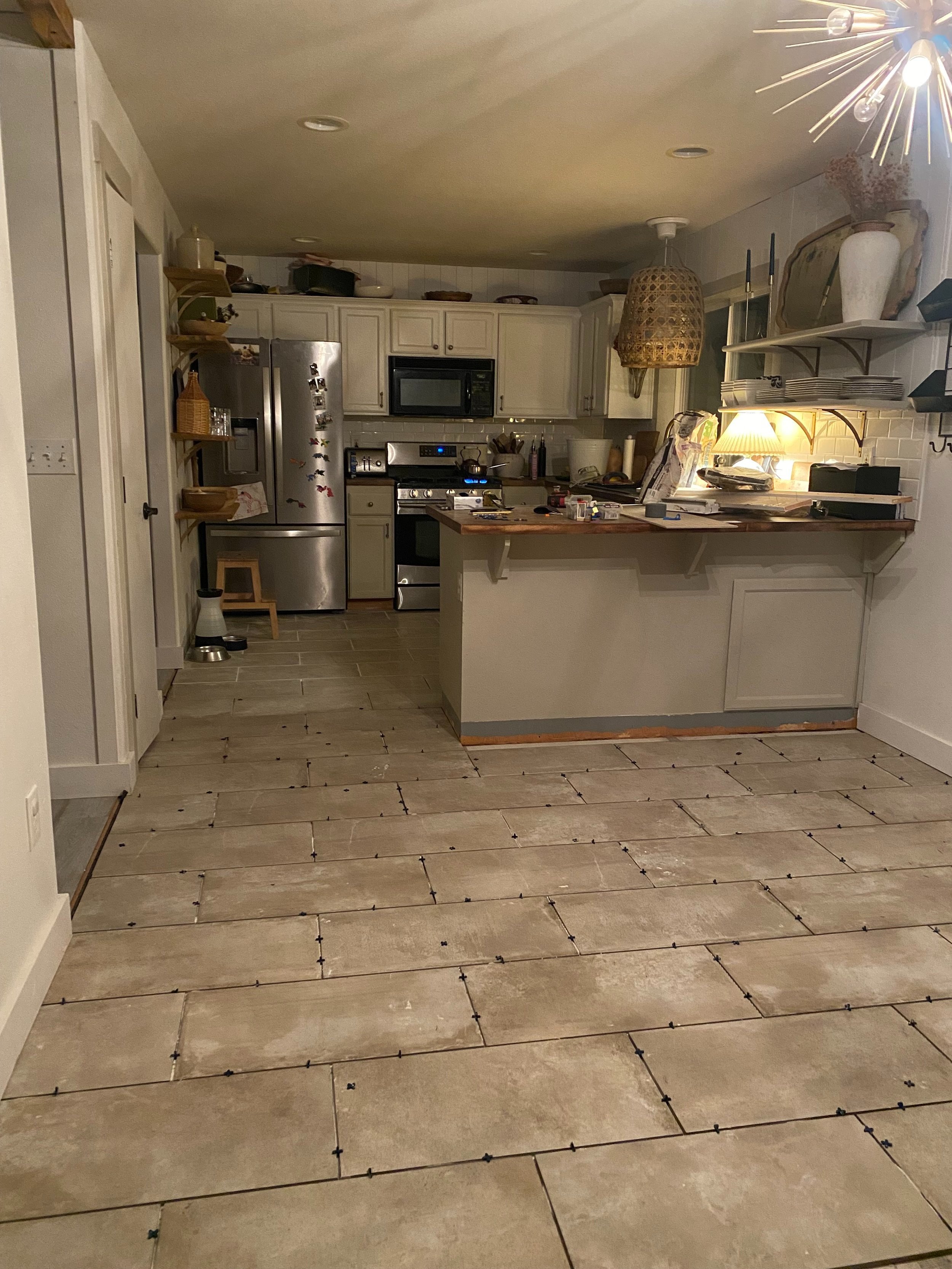
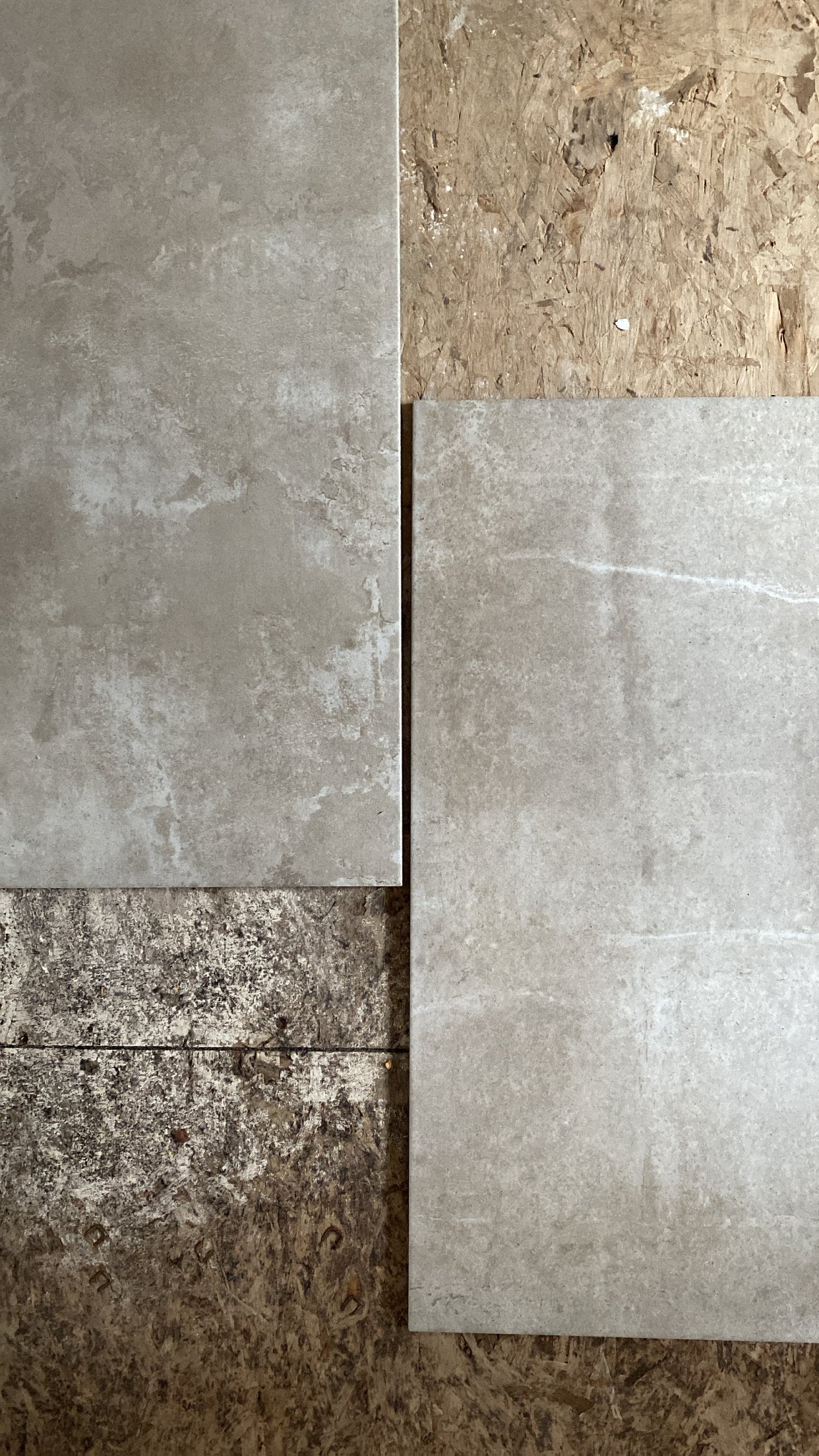
Here is the tile before we started. I placed it in the kitchen to decide whether to run it vertically or horizontally. Typically because of the direction of the rooms I would have placed them vertically. However, I felt that horizontally would display the tile better in each room. Especially when joined to the brick fireplace.

The first reveal photo after we completed this job! I love the way it looks with the newly finished wood ceiling.

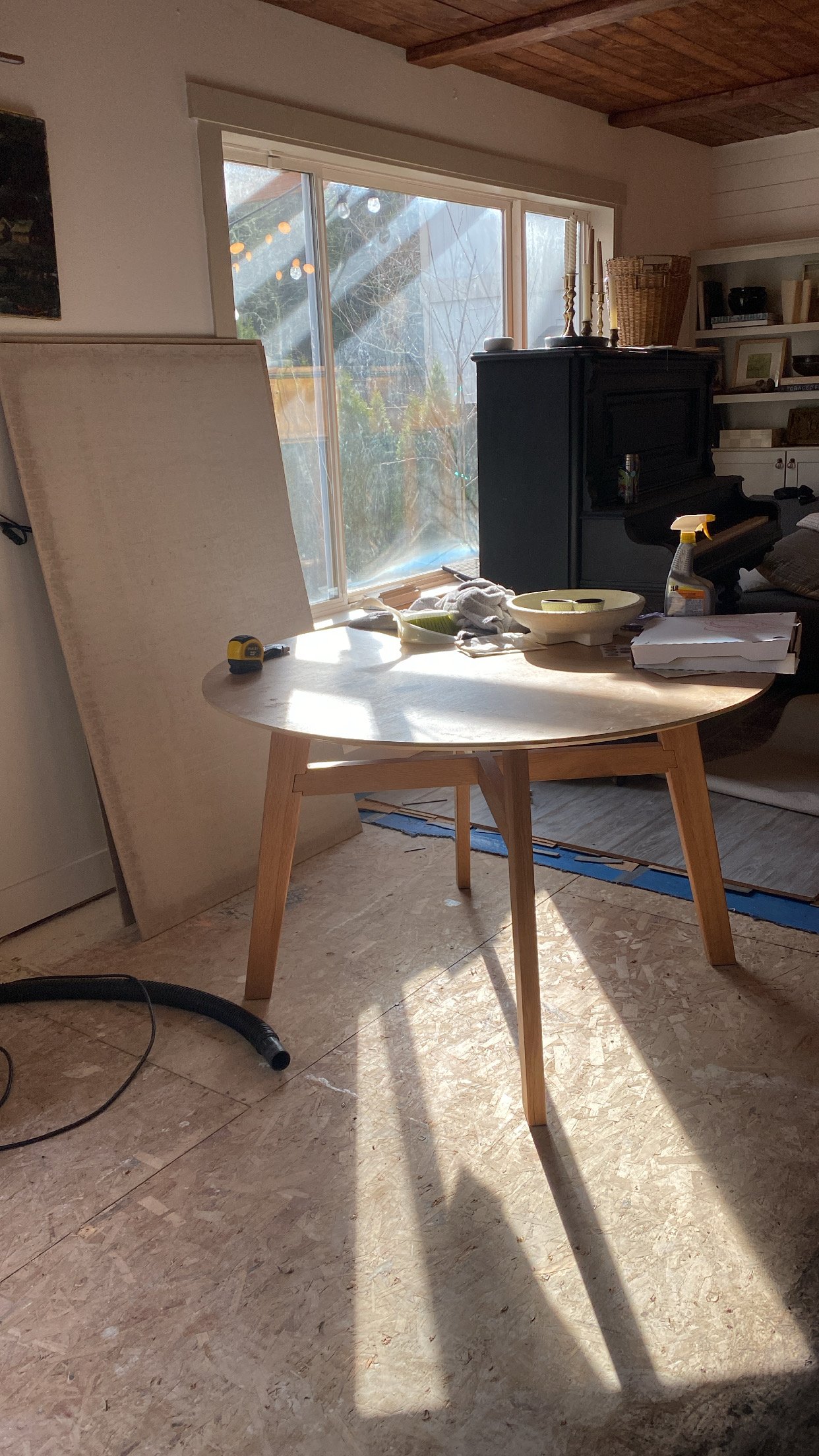
Another view of the kitchen table into the kitchen. This view assures me that I made the right decision on the direction of the tile.

This project is not for the faint of heart. Granted, we worked at warp speed to get these installed in time for our photo session - this takes a lot of work. We wanted to make sure to be meticulous on the install because this is such a high traffic area in our home. We may do a lot of projects around here, but I don’t believe that Curtis nor I have any extra skills in the subject. As long as one is willing to follow directions and make sure they are doing the job right, I think anyone can accomplish it. And doing the install on your own helps to save lots of moolah. A key factor to tiling like a pro is making sure that you are applying an even amount of mortar on the cement boards. This helps to ensure the tiles are level and using an actual level throughout to double-check that leveling. My solo job was to grout the tiles after the mortar had dried. This was a job I took seriously and honestly, didn’t even want Curtis to help with. The method is that you use a sponge to wash off any extra grout that’s applied between the spaces of the tile and I went back over my grout lines repeatedly during the process to guarantee I was getting a smooth look. Grout lines can make or break the look and I was NOT about to let this look go awry due to my own blundering.

All in all I think that we did a really great job on this considering the scope of work and the time we did it within. But I don’t know, you tile me. Get it? :)


Xoxo, Meegan

Wringing In The New Year

The month of January always brings about mixed feelings. The sense of a fresh start, the allure of what’s to come and all the possibilities of a new beginning. It also gives me dread. Here in the PNW we get little sunlight, and Curtis and I are always itching to get out of town right about yesterday. Also, after coming down from all the excitement of the holidays, it can feel like there is little to look forward to.

You’re asking yourself, “Okkkkk Debbie Downer so what is your point?

My point is that I get it. I have been ticking off the to-do list and trying to keep my head above water. I have been doing the standard rearranging décor post Christmas and that has helped to breath new life into my home. It is helping to set the stage for what is to come – the project list of 2022. These things typically come about unplanned, and my usual form of transportation is to fly by the seat of my pants. HOWEVER, I decided that with this new year I am homing in a focus of intention behind my brand. I want to be able to share with you more knowledge, more home décor, more family, more life, and to do that in a way that really gives to YOU. Yes, the day to day posts about my crazy children, messy house, latest spat between Curtis and myself – that’s still on the docket, but I want to be able to give you guys more of what you want. And in order to do that, I need structure. Hence, the to-do project list.

Gallery Wall

The Mia Interior originals that need replacing!

Now that the tile flooring is complete, I would like to move on in the same space. As we just did a mini kitchen makeover and the beams and brick in the family room – these are all connected by the tile flooring – I would like to add a gallery wall near the kitchen table between those rooms. This wall has been blank since I took down some ‘Mia Interior 11pm watching RHOBH originals’ and I want to fill the space with more life. A photo gallery is what I will be curating for this space sooner rather than later. Also, the Sputnik light fixture was cool, but I am searching for something a bit more classic, but still just as fun.

Hallway

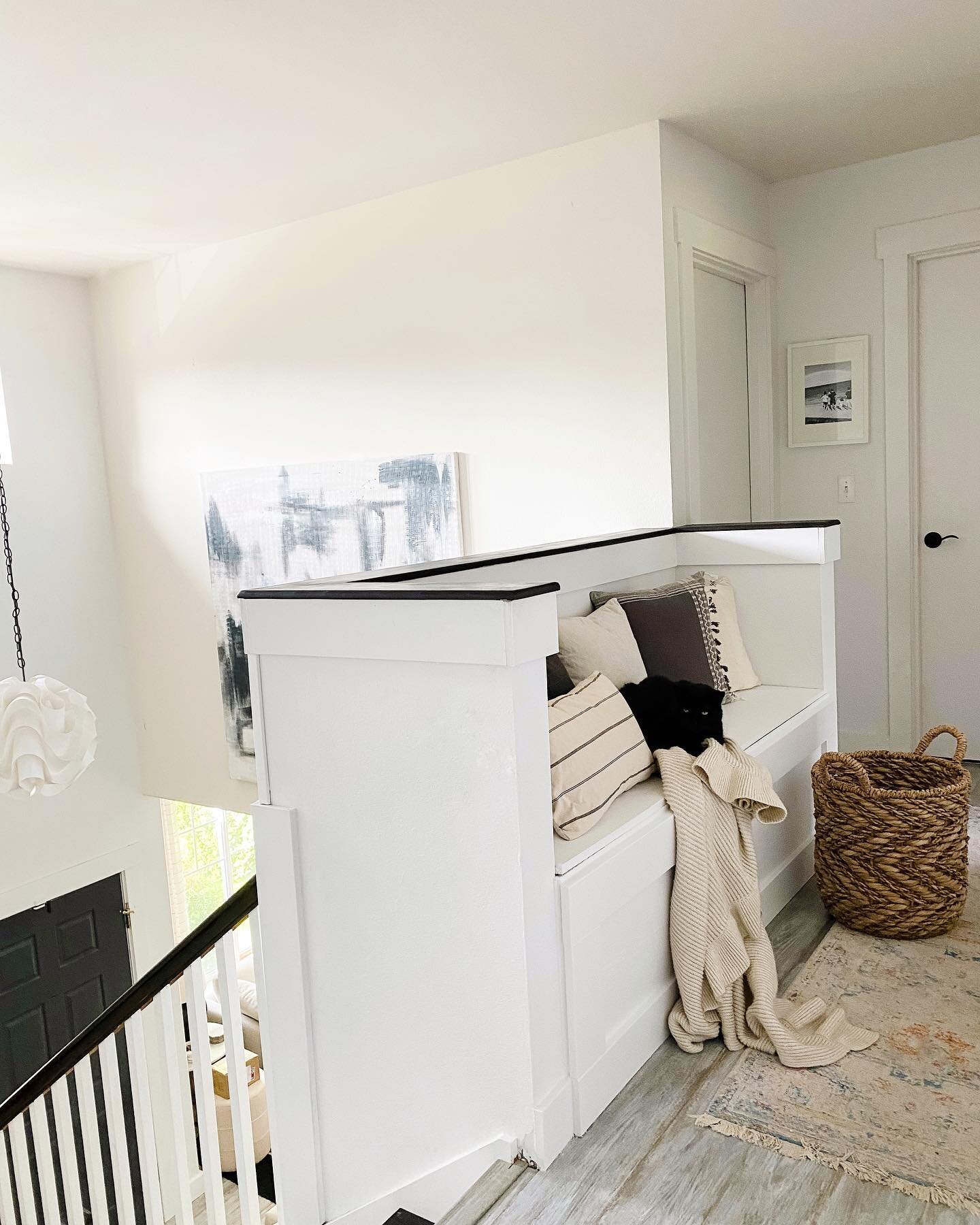
Our upstairs hallway has been through changes and through the past two years it has sat, usually cluttered with dishes that Jack doesn’t want in his room and laundry that gets put away every 3 weeks. We have had a desk out there for years that has probably been used a total of…well too few to even count. I have dreamed of a built-in bench with extra storage, fun lighting, and possibly some wall treatments. And new rugs, always rugs.

Range Hood

If you have been around for a while, you understand this one. I have been dying to get rid of our microwave that is original to the house or waiting for it to die, but it has been the eyesore that keeps on zapping. I have even gone so far as to create a PowerPoint presentation for Curtis to convince him the lack of need for the microwave. You can tell how well that went seeing as we still have that blackhole sitting above our stovetop. I have deemed this the year of the range hood. They say miracles happen, here’s hoping!


 Powder Room

A peek into the powder bath. You can shop the look here.

Our downstairs bathroom has seen a lot of changes. When we first moved in, I let Curtis pick the paint color as some kind of compromise for the fact that I was doing the rest of the house. That little nicety left me with a purple bathroom. To make it worse, this was the height of wall decals and I got Cricut happy making my own elephant ones. In gold. That powder room definitely takes the gold in worst design execution. We are now to a place where it’s a moody, little space with character, but the dated faucet is, well, dated, and I want to continue the vintage art collection to cover all of the walls. I am also toying with the idea of wallpaper!


So that’s it! The list is short and sweet and is sure to be added to, but to get us started with 2022 I will be focusing on these four additions to our home. Here’s to wringing all the creative juices out of myself this New Year. Cheers!

Xoxo, Meegan

Mini-Kitchen Makeover

You can shop my kitchen here.

Mini-Kitchen Makeover

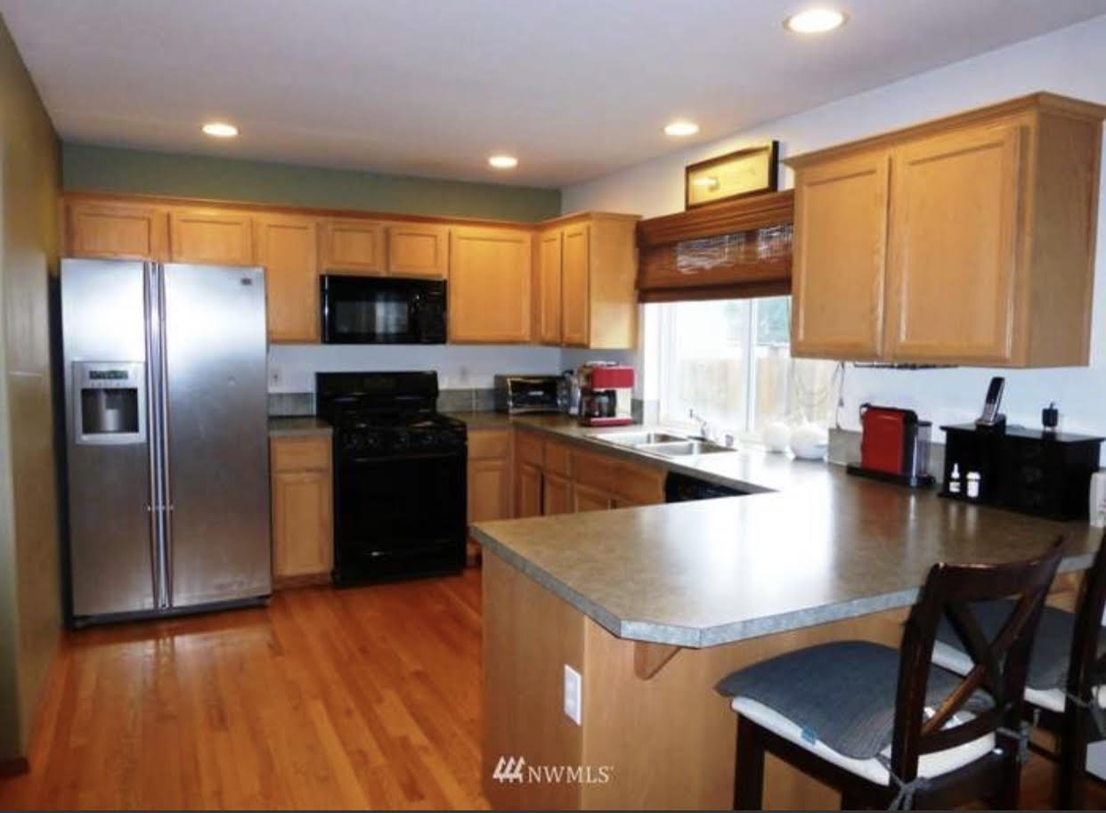
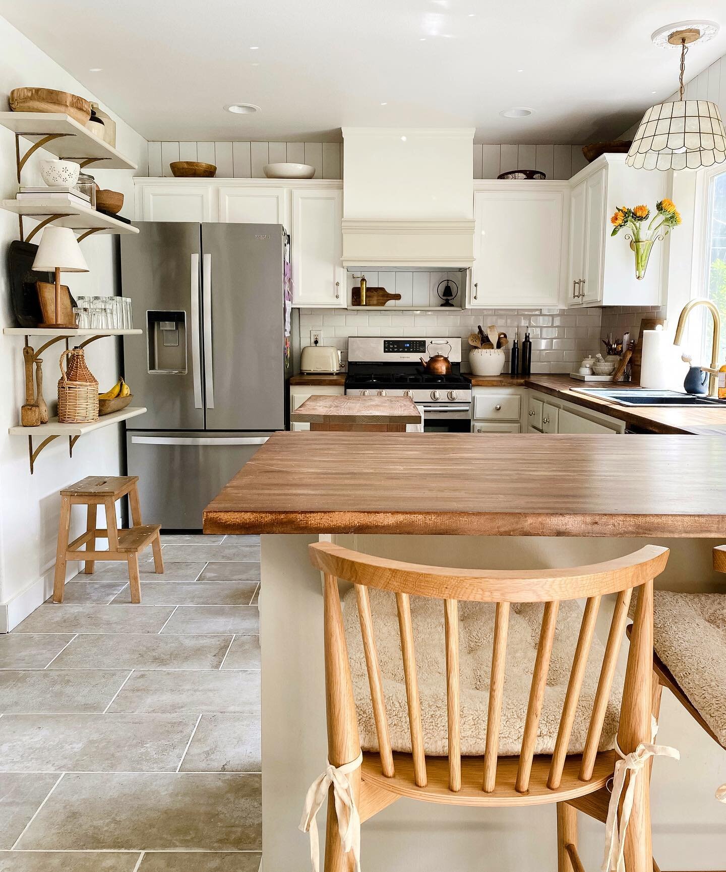
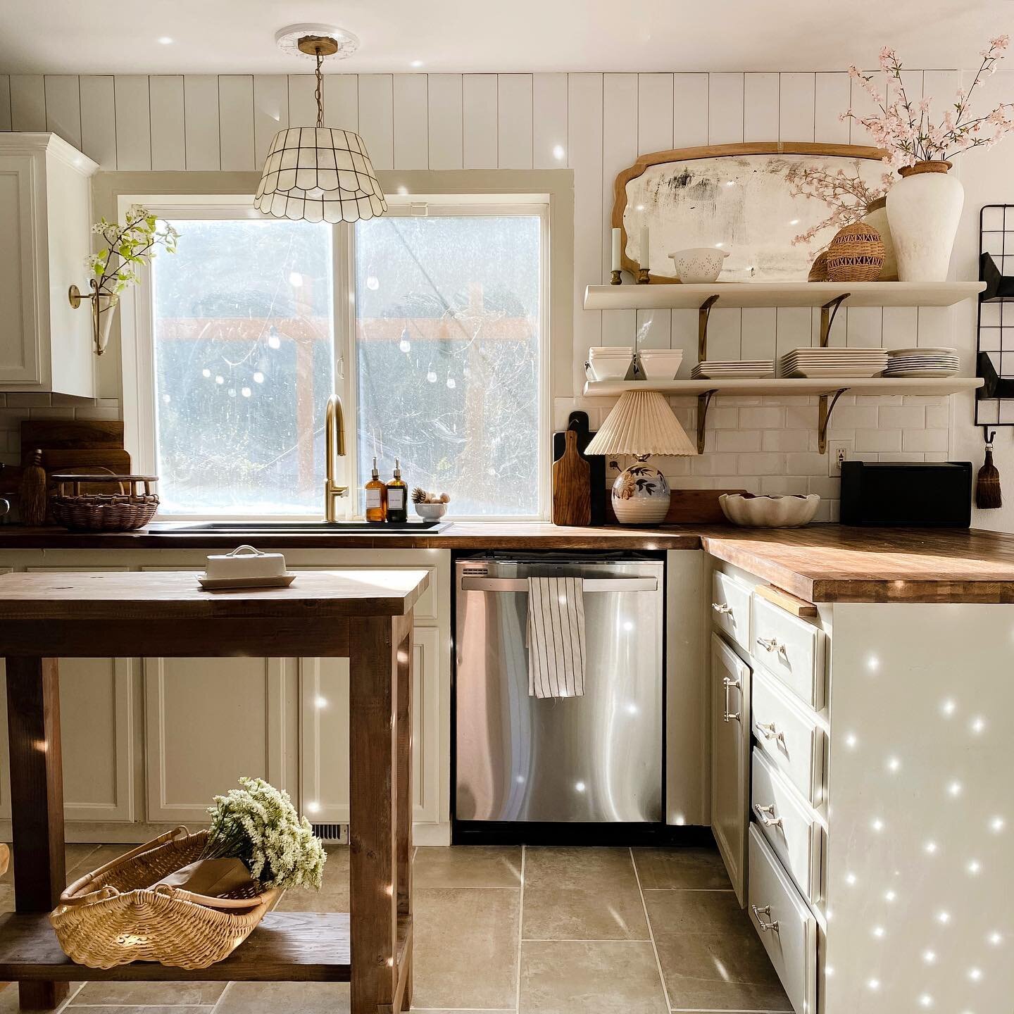
 When Curtis and I bought this house 5 years ago, it was our second home purchase together – the first of which we did larger scale home projects on. The kitchen was one of the first things I touched because the 90s oak cabinets were killing my vibe. After painting those I then painted the dated green tile backsplash. It took a year before we replaced the green, laminate countertops with butcherblock and the original stainless-steel sink with a white, budget-friendly inset. Well, you live and learn with this home ownership, right?

The pull-down faucet and the accessories make kitchen time more fun.

Just as my style changes, so did our sink. I swear every day it got a bit dingier and the only person capable of cleaning it was my grandma who has magical cleaning powers. Also, what we didn’t think about when pulling the trigger on an undermount sink was that the exposed wood of the butcherblock counters would be hard to seal. It became splotchy around the edges of the sink and the wood began to crack. It was inevitable – we needed a new sink.

When Kraus reached out to me about doing a collaboration together, I was ecstatic! I had heard nothing but good things about their products and this felt like a need and not like my usual “needs,” i.e., that bowl, vase, sneakers – this we could both get behind. This time, when it came to selecting our products, we needed to meet two criteria – 1. It had to be an overmount to protect the wood counters, and 2. We wanted a dark finish so that the sink in all appearances looked clean, I need that forgiveness.

We decided to go with the black granite composite from Kraus because the style checked off all the boxes. Plus the accessories that come with it are our favorite part. Literally, Curtis has said unsolicited, on multiple occasions, how much he loves our new sink. You know it must be good! The cutting board with slats is genius and the drying rack that sits over the sink (you can’t leave wet dishes on butcherblock) is a dish-washing game changer.

Bellucci Composite Sink

Bellucci Composite Sink and accessories.

When it came to selecting a faucet, this was one of my “needs,” not needs - but you know me and I was more than happy to update our kitchen with one of my favorite metallic finishes, brushed brass. The pull-down faucet was a modern addition to our kitchen which holds a more cottagey look. I was happy to incorporate this contrast that compliments the gold accents I use throughout our home.

When it came to the install of the sink, I have to admit, I was nervous. We measured to make sure we were getting the right size of course, but you never know with these things. It ended up being exactly the right dimensions to fit centered between our dishwasher and cabinets. That additional 1”, I swear, makes all the difference. What do you know, size does matter. Kraus includes a template to measure and cut by with their sinks, and we were easily able to mark the counter according to this guide. After using a jig-saw to cut the right size hole, we then used a silicone sealant around the edges of the underside of the sink to adhere it to our counters. It is easy to follow along with the instructions on install; which clips to screw in and where to screw them.

The faucet install was all that much easier. Again, we were provided with thorough directions on how to disconnect the water lines and get that beauty up and running…hot and cold water. It may have taken me a couple tries to get the water temps running right, but if I can do it, YOU can do it.

I was elated with the look of our new Kraus products, but it felt like it left the rest of the kitchen feeling blah. Like I said earlier, my style changes and the lighter counters didn’t feel as warm as they used to. I decided to risk it all, and I mean all, if you caught my IG stories on this process then you know – it was a process! I have done the counters myself in the past, but that was always using a clear polyurethane coating that didn’t require any meticulous sanding or staining. I ended up having to re-sand twice to get the color right and I may have threated to use all the sawdust as ignition to light my kitchen on fire. Ultimately, the color Early American from Varathane came through as the perfect shade to warm our kitchen.

As these things go, one thing led to another and I decided that the black grout of our subway tile clashed with our dark counters. I had heard great things about grout paint pens and first tried this from Amazon. They probably work well on dingy grout, but I soon learned that black would require a lot of coverage and I just didn’t have the patience to continue on. I ended up stealing the tiny brush from one of my kid’s watercolor sets and then with the white paint of our interiors, I painted over the black and less-black from the pen. It worked phenomenally well! I did need to wipe excess off the tile from time to time, but all in all it was a great turn out. That pop of the white tile against the dark counters was exactly what I wanted!

But wait, I still wasn’t satisfied. I am a lover of wood tones, that is clear, but there were way too many, IMO, going on in our small kitchen. The island was different than the open shelves that were different from the counter stools that were different from the newly stained counters. Not to mention all of the wooden accessories I have styled on the surfaces. The easy solve was to stain the island the same as the counters and to paint the open shelves above our counters the same as our lower cabinets. NOW it all tied together.

Oops, I’ve withheld information from you. During the in between time of installing the sink and pull-down faucet and not sure whether I should pull the trigger on staining the counters I did a thing. We have had a DIY chalkboard in our kitchen since we moved in, it was probably one of the first projects I had Curtis do in there. Side note: at that time I was afraid of power tools and saws and cutting and well, now I think how easy that project of trimming around a rectangle of chalkboard-paint would be. We stopped using it for grocery lists and it became more of a chore list, and then even more of just whatever the kids scribbled. Point is, it didn’t get used much and it felt like wasted space. I figured that we could probably add some additional storage there by adding some more shelving as we did above our countertops. I used the same stair treads that we did on the other side of our kitchen, yes they are stair treads, and cut them to size. We used stair treads at Curtis’ suggestion because their rounded edge gives them a more finished look and for $10 a pop, it’s a bargain. These I stained with Golden Oak and then used brackets to secure them into studs. And as Curtis would tell you, I can’t do anything the easy way – I’m high maintenance. So, the black or white options in brackets were not the right fit. I purchased white brackets from Home Depot and used Rub’nBuf in European Gold to give them a vintage vibe. They are dreamy, don’t you think?

The best part is styling them!

Next week we’ll be hosting Thanksgiving for the first time with our new appliances from Kraus and the updated kitchen and I couldn’t be happier! Our kitchen gets a lot of love in this house and deserves all the love that we put into it. I feel that it reflects our home better with it’s latest changes and the functionality between the sink and the additional shelves has made it a much easier place to spend all . of . my . time. This house of ours isn’t perfect, it’s not a million-dollar home, and maybe it’s nothing to write home about – just a blog post.
 

Xoxo, Meegan

Here’s what our kitchen looked like when we moved in.